When most people think of a “brand”, the first thing that comes to mind is a logo. While a logo is a key brand element, and typically the most immediate visual association with a company, there is much more to a brand. A brand is how people perceive your company. The brand is in an essence - your company’s DNA.
While we have been building Pakistan's first embedded finance platform to financially enable underbanked communities, our brand could not keep up with our pace of growth. We realised that our current brand identity required a refresh, as it wasn’t fully justifying what we stood for and our vision. Therefore, we embarked on the journey of upgrading our brand to truly represent us.
Our refreshed Neem brand identity would not have come to life without the dedicated and creative team behind it. The leadership of our Neemer, Umayr Khan, and a collaborator, experienced designer Usman Ibrahim, has allowed us to represent Neem in such a way that makes us proud. Thank you! ❤️
At Neem, we strongly believe in the value of collaboration, hence it became clear from the very beginning that our brand’s success would heavily depend on the entire team being united behind it. We are a lean team and it was important to come together for some good old-fashioned creative strategising. We started the brand design process by engaging the whole team in a survey to define our brand's personality and our core brand attributes.
We used a simple questionnaire to gather these insights from our Neem team. The key questions revolved around the following points:
The conversations about the results of this exercise helped us define who we are and what we want to accomplish together. What mattered the most was that we managed to create a safe space to freely express ourselves while giving input to the direction of the brand.
Getting everyone aligned is critical for a successful rebrand. Make sure to inclusively open up the process to the entire team, as it will create a sense of ownership and pride felt beyond company leadership.🌿
Once we defined our Neem brand attributes, we kicked off the visual identity exercise. Our goal was to transform the survey findings into a refreshed brand identity that would authentically represent our brand.
We started off with the competitive study of logos of similar international and local players in the market. What we found out is the logos that worked well had simple, scalable, recognisable, and memorable marks. In comparison, our old Neem logo suffered from the following challenges:
After the competitive landscape overview, we started sketching a few logo ideas on paper, in order to get some quick concepts out. The visual inspiration for our Neem logo was derived from the well-known South-Asian Neem tree, with its nurturing and healing effects on the communities where it grows. We’ve been inspired by its resilience, strength, and positive impact. It matches our vision of expanding the impact of Financial Wellness for many underserved communities across the emerging world.
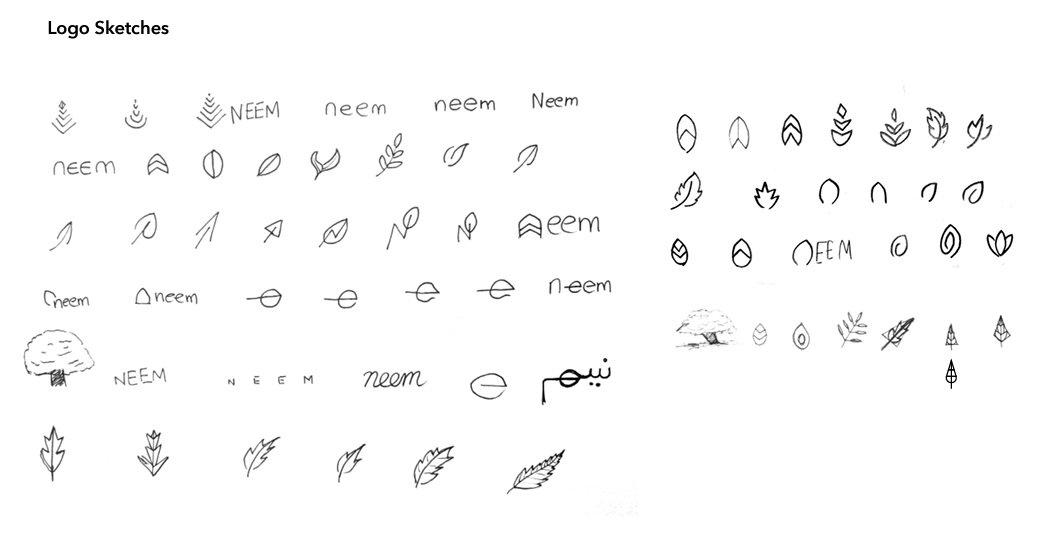
We played with different shapes of the neem tree leaf and thus, a refreshed icon and word-mark were born. The refreshed Neem logo is simple, scalable, recognisable, with a deeper meaning. The Neem leaf combined with the upward arrows represents the growth and nurturing impact towards our underbanked communities.

.png)
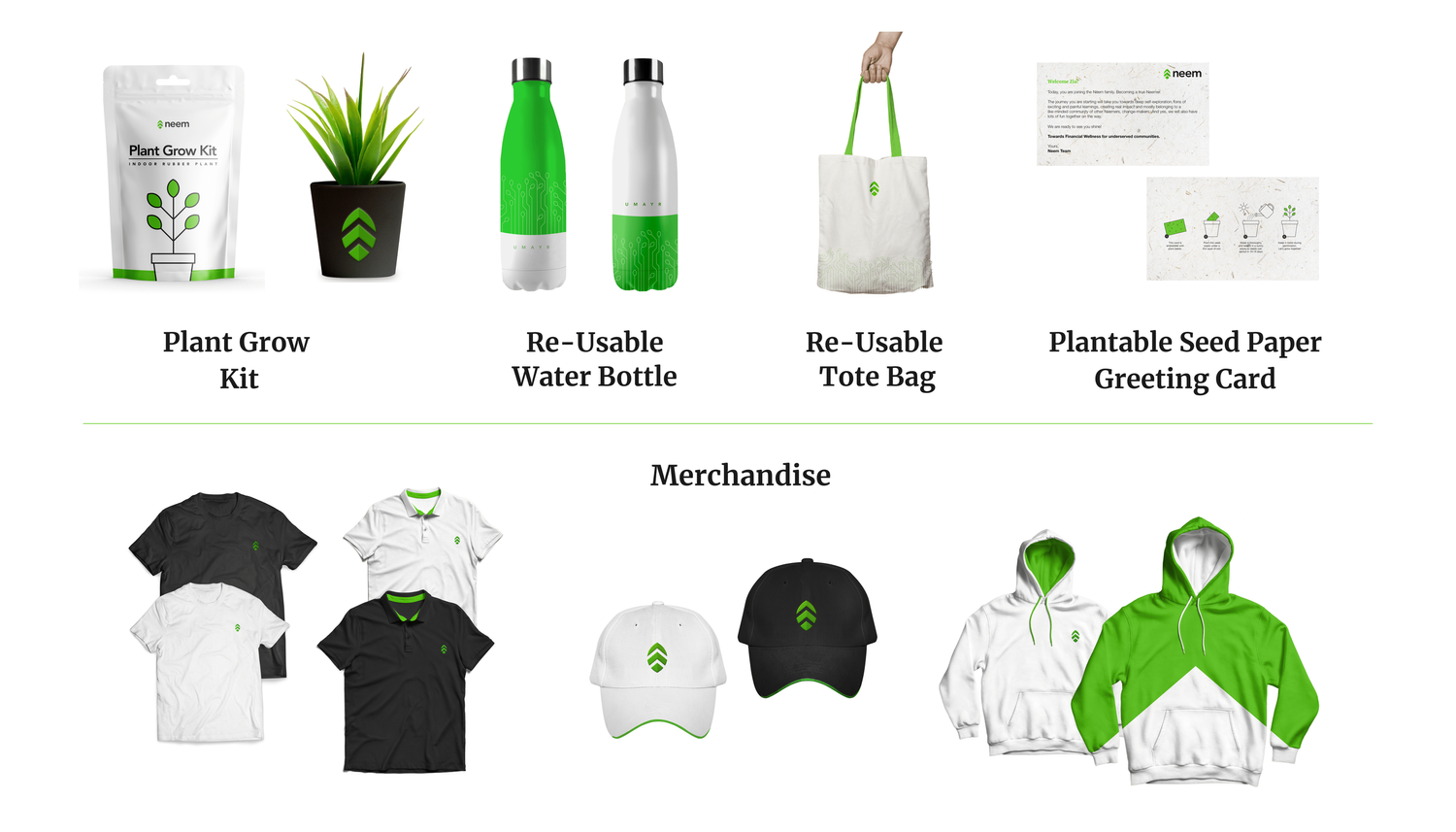
The next step in the process was to create design elements that could be utilised for the brand’s visual language, across different mediums such as social media, website, swag and others. We dissected the Neem logo to create those design elements.
Neem design elements consist of the leaf, the stem, and the upwards arrows. They are versatile in nature and provide creative freedom to be used independently or in combination for different use cases.
Using the elements derived from our logo, a circuit-like structure was created from the Neem leaf and stem to represent the full breadth of our Neem identity - our pioneering and experienced attributes as well as the nurturing part. This has become our core visual element applied across different mediums; merch, internal documents, website, print, as well as our digital assets.
The last step in the rebranding process was to bring everything together. For that, we created a comprehensive brand manual detailing Neem’s design principles and a guide for our team to refer to for clarity and consistency.
From a visual perspective, the Neem brand manual also serves as a foundation for building a design system that would be used to design Neem’s digital products. Therefore, we set out some ground principles on how the logo should be used correctly, and what typography and colour palette should be utilised with a focus on legibility and accessibility. We documented the recommended usage and illustrated a few samples of those implementations to help the team visualise Neem’s refreshed identity.
When it comes to branded merch items, we laid down essential principles that allow us to stay true to our core values, what we care about and our brand attributes:
At Neem, we know that our brand will be constantly evolving, expanding and growing alongside us. Therefore, we will be frequently revisiting the current brand manual and our core design principles to make sure, they fully and truly represent who we are and how we engage with the world around us. In case you would like to learn more about our rebranding process and exchange learnings, contact us directly 📩 umayr@neem.io. We are ready to hear from you!
FROM THE BLOG

© 2023 Neem
© 2023 Neem
Neem is a fully licensed Non-Banking Finance Company (NBFC) by Securities and Exchange Commission of Pakistan to carry out and undertake Investment Finance Services (IFS). Neem’s banking services are powered by Branchless Banking partnership with JS Bank in Pakistan.


.png)
.png)
